Nasdaq / S&P 500
The Nasdaq to S&P 500 Ratio measures the relative difference in valuation between the tech stocks represented in the Nasdaq 100 and a basket of broader industry stocks from the S&P 500. This metric peaked at the height of the tech bubble.
Live Status
Metric Background
Stock indices hold different baskets of underlying companies. The Dow has 30 well-known big company stocks, the S&P 500 has a lot more stocks covering a large portion of the total market, and the Nasdaq has a lot of technology stocks.
Because of the differences in the underlying constituents of each stock index, you can create some interesting ratio comparisons by simply dividing one index by another. A great example takes the Nasdaq divided by the S&P 500:
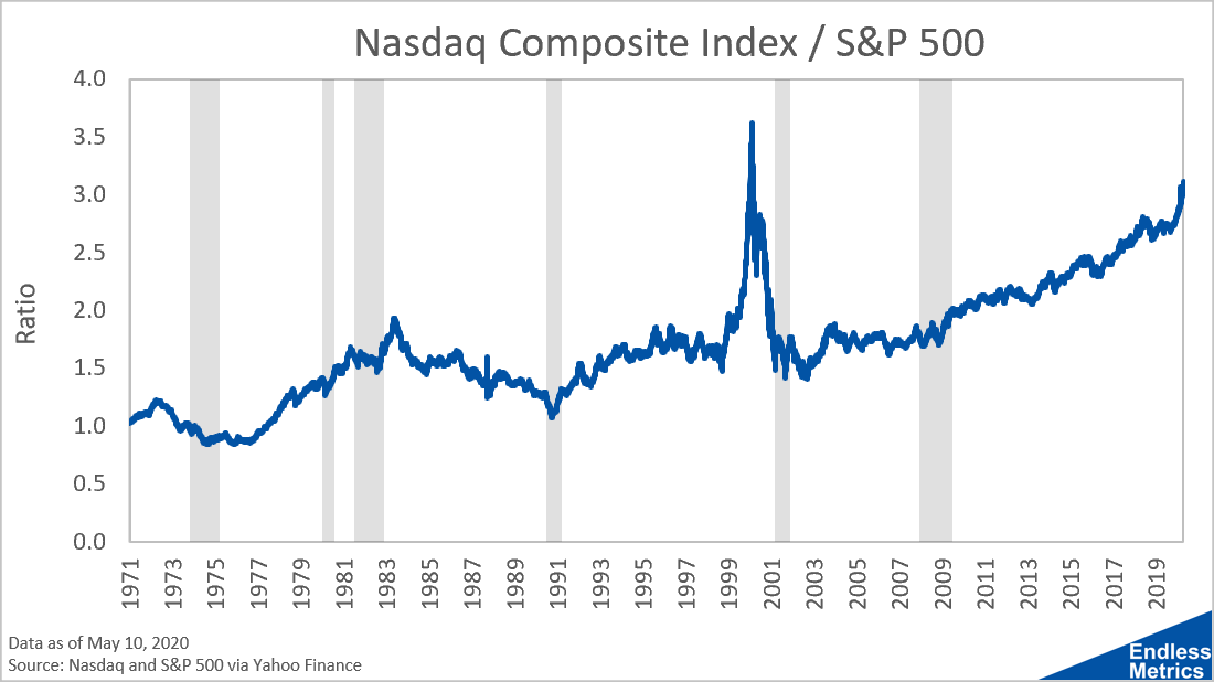
The way to understand this series is that changes in the ratio over time are driven by different performances between the indices. When this series rises, it means that investments in the Nasdaq outperform the S&P 500. Since the ratio has generally risen over time, it shows that tech has made larger gains than the broader market.
The large deviation represented by the spike was caused by the tech bubble. At that time, the value of tech stocks skyrocketed beyond the overall market.
So, what do we make then of the current rise? It hasn’t been a sharp spike like the tech bubble but since the Financial Crisis the climb has been relentless. Most recently, it actually did spike, as the coronavirus benefited the large tech companies in terms of stock performance.
While tech companies have make amazing products and provide awesome services, it does seem surprising that tech could outperform everything else by that much. This is even crazier when you realize the S&P 500 has a lot of tech companies in the index as well.
Ultimately, for this trend to reverse, we’ll have to see huge underperformance of the large tech companies. That’s, honestly, not a bet I’m willing to put money on right now.